July 23, 2018 Your Guide to Mobile-First Design
Mobile-first design starts small. The ideas and creativity aren’t small, but the screen is. So, why start with the smallest screen? While most websites have been mobile friendly for some time, mobile-first design is different. The customary design process has been to create desktop and scale for mobile. But it no longer aligns with the way users spend time online. Mobile has taken over and shifted everything about design and the user experience (UX). But starting with mobile isn’t easy because it’s smaller. Instead, it’s considered the hardest medium because of the size, yet it immediately helps you drill down to the basics of UX. If a site can look good and function on mobile, scaling up is much easier than the reverse.
How mobile-first design is different
With mobile-first design, there are not separate desktop and mobile versions. The design concentrates on the mobile experience and how a user would interact with content. Mobile-first means you are designing for touch, whereas starting with a desktop is designing for the click. That doesn’t mean that desktop isn’t important. There are many occasions on which users do the research on mobile for convenience then make decisions or purchases on desktop. In these cases, mobile isn’t the medium of conversion—but without its high-value UX, it would not have occurred. When a user later accesses your site on desktop, it will provide the same experience, just expanded.
Graceful degradation and progressive enhancement
Graceful degradation describes the need to have a site function across a variety of device types and sizes. The mindset of this philosophy is to find the best design that covers the majority—accounting for the possible degradations along the way—and most importantly, to keep the site functioning. The desktop was the first design, removing certain blocks of content with each change in scale (as the screen size became smaller). Progressive enhancement is the approach that supports the mobile-first recommendation. Design for the mobile version first, then enhance as the size changes with new blocks of content. But progressive enhancement isn’t the same as responsive design. Responsive design is the concept of media queries that target specific devices and viewport sizes. It works in tandem with progressive enhancement.
Mobile is where your audience is
The overwhelming reason to start with mobile is that it’s where your users are. Globally, the breakdown of online activity across devices is: 52.64% mobile, 42.75% desktop, and 4.62% tablet. Consumers use mobile to interact with a brand, read content, open emails, engage on social media, and make purchases.
You can’t screw up mobile UX
UX is complicated. It’s not a cookie cutter element in design. Every page has a different objective. When you strip down to the absolute basics, as occurs in mobile-first design, you start building a UX foundation that is relevant. On mobile, the focus is on the most visited parts of your website and how to get there. At the heart of mobile-first UX is navigation. It must be easy and intuitive. Because if your UX is not up to expectations, users will bail. Google estimates that 61 percent of users will not return to a site they had trouble accessing on mobile, and 40 percent of users will then visit a competitor’s site instead. You can’t afford to not emphasize mobile UX if you want to keep users on your site.
Mobile-first is content-first, too
Not only is the UX stripped down but the content is as well. Whatever your product or service, to get mobile-first design right, it’s got to be understood in a glance. This translates to several areas, including:
- Relevant, contextual imagery or video that clearly communicates visually what you do
- Direct copy that incorporates value propositions and concise language
- Options for the user to learn more or go deeper into the site (e.g., icons for products or services)
- Calls to action that provide the user an avenue to connect with you
- Help and contact information that’s easy for users to find
But you have to fold all of that into a lot of limiting parameters. It helps you define the most important visuals and messaging that will add to the foundation you’re building.
Mobile could be the only way users see your site
According to research, 25% of mobile users are mobile-only (they rarely or never use a desktop). That means a quarter of your possible audience will only see the mobile version of your site. This compelling data point supports the need to move forward with a mobile-first strategy. Think of it as just another way convenience matters to users. They can be anywhere and use a smartphone; desktop sessions require more effort. One experience across all devices matters — because many first visits begin with a mobile search. Currently, almost 60% of all searches are completed on mobile. Desktop experiences are an expanded version of mobile, not a different one. 
App vs. mobile forward
There are differences in the UX and design for apps versus mobile-first websites. They are both focused on touch interaction, but they have a different function. Apps usually have even fewer features than mobile, meaning certain actions a user would want to take aren’t available in the app. Apps focus on repeatable actions or tasks, like transferring money or counting calories. So app design has an even smaller concentration that’s very specific. In comparison, the U.S. Mobile App Report found that the number of mobile browser sessions is two times larger than that of app audiences. The answer is to create an app-like experience. This type of design drives returns and facilitates organic growth. A mobile design that takes on these characteristics allows users to maneuver and convert easily. When users enjoy a great experience, they’ll come back. As new features or updates are made, returning users will continue to appreciate such a seamless process.
How to be mobile-first
When you make the decision to design with a mobile-first approach, there are a number of factors that must be present and strategies that must shift. If you’ve been in a desktop-first design mode, it’s time to shift your thinking around design and UX. Your customer is what’s driving the functionality and experience of your mobile website. Users often won’t tolerate “different” experiences across platforms. If the mobile site offers a promotion or allows for a way to sort or filter results, then that same experience must transfer to desktop. Otherwise, customers will be confused. This turns into an expectation gap. You’ll let your customers down and they’ll move on to another site. Be prepared and proactive in updating and upgrading your mobile experience. Your visitors will thank you for it.
Get started with mobile-first design with Topcoder
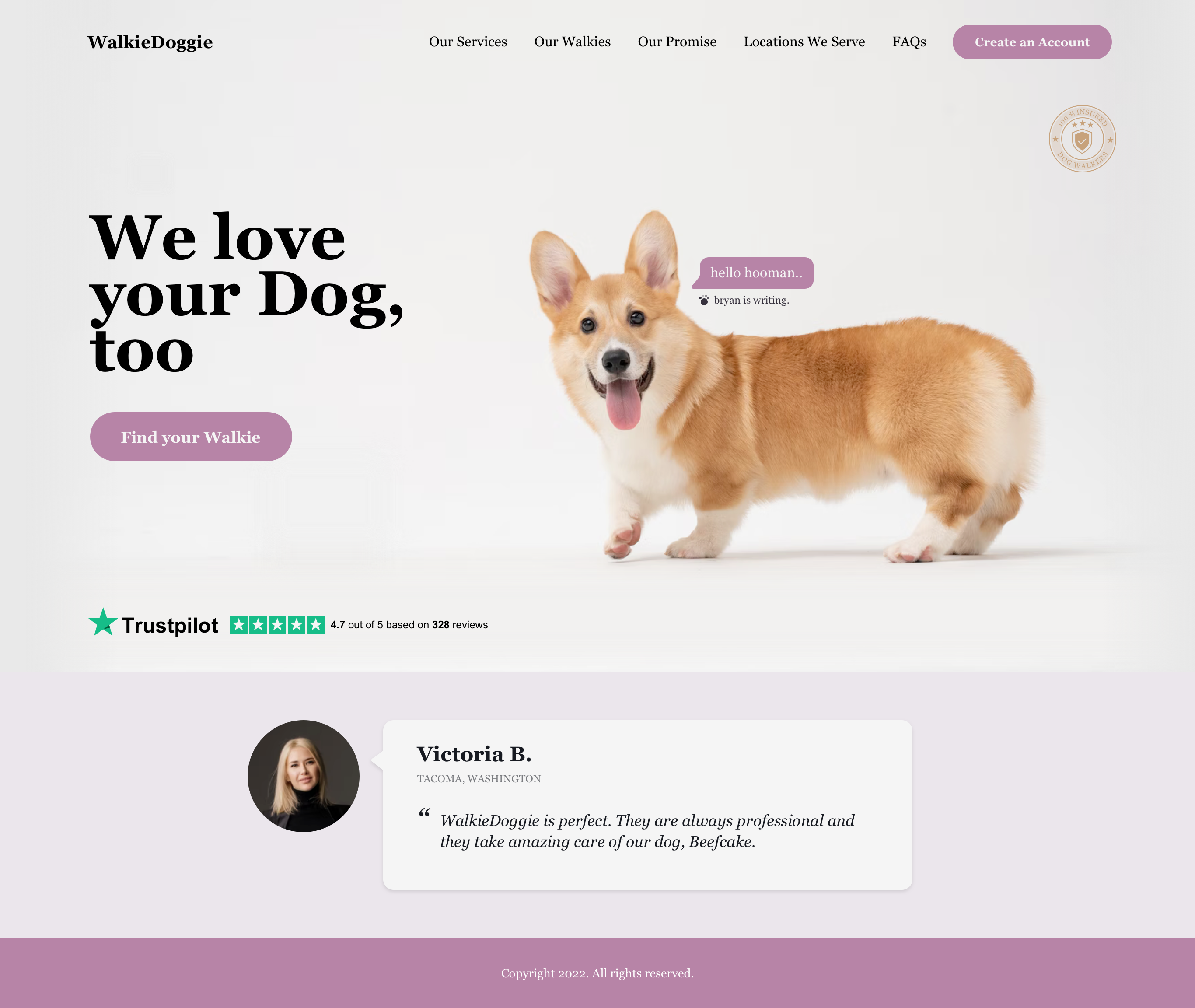
With Topcoder’s community of hundreds of thousands of designers, you’ll see multiple design options from top-rated designers — all with different influences and perspectives. You can expect smart, UX-friendly, mobile-first design. With great optionality and speed, you’ll be able to find the mobile-first design that feels right for your brand. 
Beth Osborne