May 28, 2019 Minimalistic Design Best Practices
The minimalist design trend is becoming very developed lately. This is supported by the increasing use of applications in various media such as websites, desktop apps, and mobile devices. With a minimalist style, your design can be applied to various media because it has better screen compatibility and faster loading time due to the reduced amount of content.
But at the beginning of implementing a minimalist design, we often find several obstacles. One is how to minimize the amount of content, making it easier for users to access all the features in the application with a limited display. This will be experienced by some beginners who want to apply this style.
Even experienced designers can make mistakes such as designing products that look like they are not finished because they do not think about the overall design. This can leave users confused because the navigation section could be hidden to support the minimalist style.
Therefore, here are some tips for creating a design with the right minimalist style.
Learn the main principles of a minimalist design style
Design can be said to have a minimalist style if the design meets the following criteria:
- Has a user-friendly interface
- Has lots of empty space
- Designed with no more than 3 colors
- Does not have excessive details such as color transitions, shadows, and textures
- Has balance, harmony, and contrast

White space optimization
The good application of white space is one of the main tricks for creating a minimalist style. By optimizing white space the display will look uncluttered. The white space referred to here is not necessarily white, it means the distance or space between content. You can make the content more visible by adding negative space around it. Make sure empty space directs the eye in a logical pattern through the content.
Apple website design is one website that applies an example of optimizing the use of websites to highlight products offered to consumers

The right coloring concept
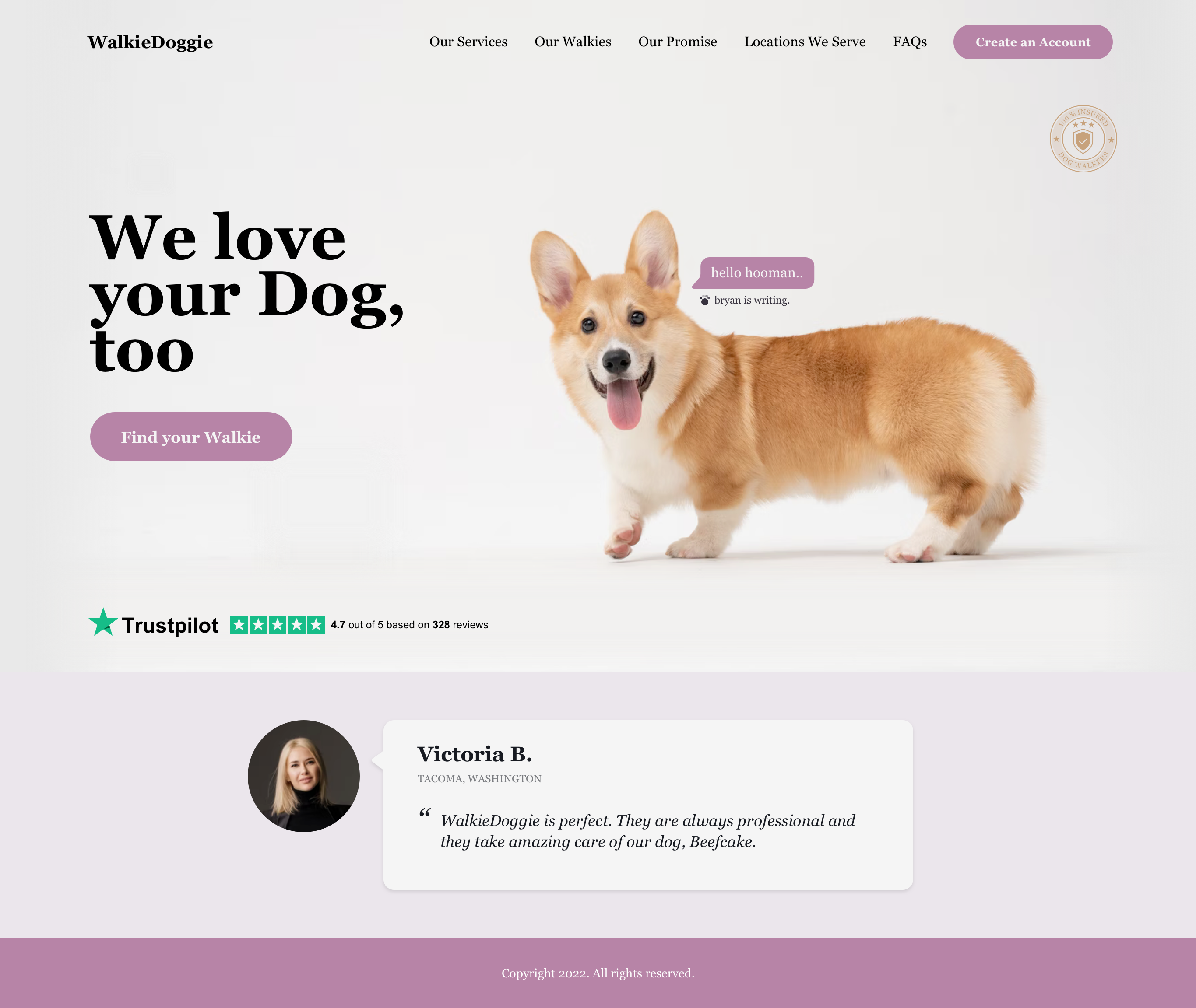
Using the right color can reinforce the minimalist style. It is recommended to use bright colors combined with several complementary colors that are more soothing and softening. Then match that with black and white fonts so that the text stands out more. Use only the colors that are needed so that your design helps create a hierarchy of content and makes it easier to direct the user to take action on the UI without having to add additional elements.
The following is an example of a website that uses the right color usage to form a good content hierarchy

Use elements if needed
In applying a minimalist design style, make sure the items in your design have a purpose. Don’t play around by putting unnecessary items on the design. The fewer items available in the design we make, the stronger the meaning or function of the remaining items. The philosophy of minimalist design style is centered on the idea that you have to design content as king and a visual layout that honors the king. The idea is to make the message clearer not only by eliminating distractions but also by staying focused on the content. Thus, the design you make must highlight your content and the CTA button clearly and unambiguously.
The following website applies only the concept of using content that is important without unnecessary introduction and interference

Create content interest with fonts
In a minimalist design style, the proper application of typography can compensate for the rare use of images and animations, making your UI look visually attractive. Fonts create hierarchies, help users detect what is important in your design and help them find the direction of navigation in the UI that you created. Sans Serif type fonts are the best choice for creating a minimalist UI style due to their crisp and clean appearance. Font size is also an important aspect that we cannot forget for a minimalist design style, especially when the UI design that we create does not have any UI elements. Using a small font is a great way to convey information because it doesn’t take up a lot of space. But be careful, because small text can easily be lost on the UI display and make the UI look dirty and annoying.
You can see examples of correct typographic applications on the following two design agency websites.

Prepare the right Navigation System.
Don’t forget to provide the right navigation system in the minimalist design style that we make. Most designers remove any content or elements that are considered excessive. However, when removing elements that are rarely used, make sure you do not hide instruments or important links for your users. One way is to make the menu button untouched and summarize the rest of the navigation buttons in it. You can hide the home button in the company logo. Also, make sure that the button is highlighted in a certain way so that the button can really be clicked on.
The following website applies a good navigation-making technique as written above
Conclusion
Minimalist design is one of several design styles that are widely used today due to the ease of application and the long-lasting style. But before applying this style of design to the UI that you make, make sure your goal is to create a design that can help users solve problems. Don’t overlook how the design you create can help the company’s business continuity.
iqbalhood
Guest Blogger
