May 3, 2018 Design Month How Tos: Effective Landing Pages
A landing page is the page the user lands on after clicking on an ad, that will summarize your product benefits in a very concise manner. An effective landing page will have high conversion, as most of the visitors ideally turn into customers. Such a page would create a great first impression, through design and content, as it has a convincing power to speak to anyone checking it.
A landing page serves a particular purpose and that can be to either sell something, or encourage visitors to donate money, sign up for something, or take any other action. A great one will support entirely the call to action and can increase the customer’s sales, so it’s important for any designer to know how to design a killer landing page.
There are however, some best practices you can use to increase conversion:
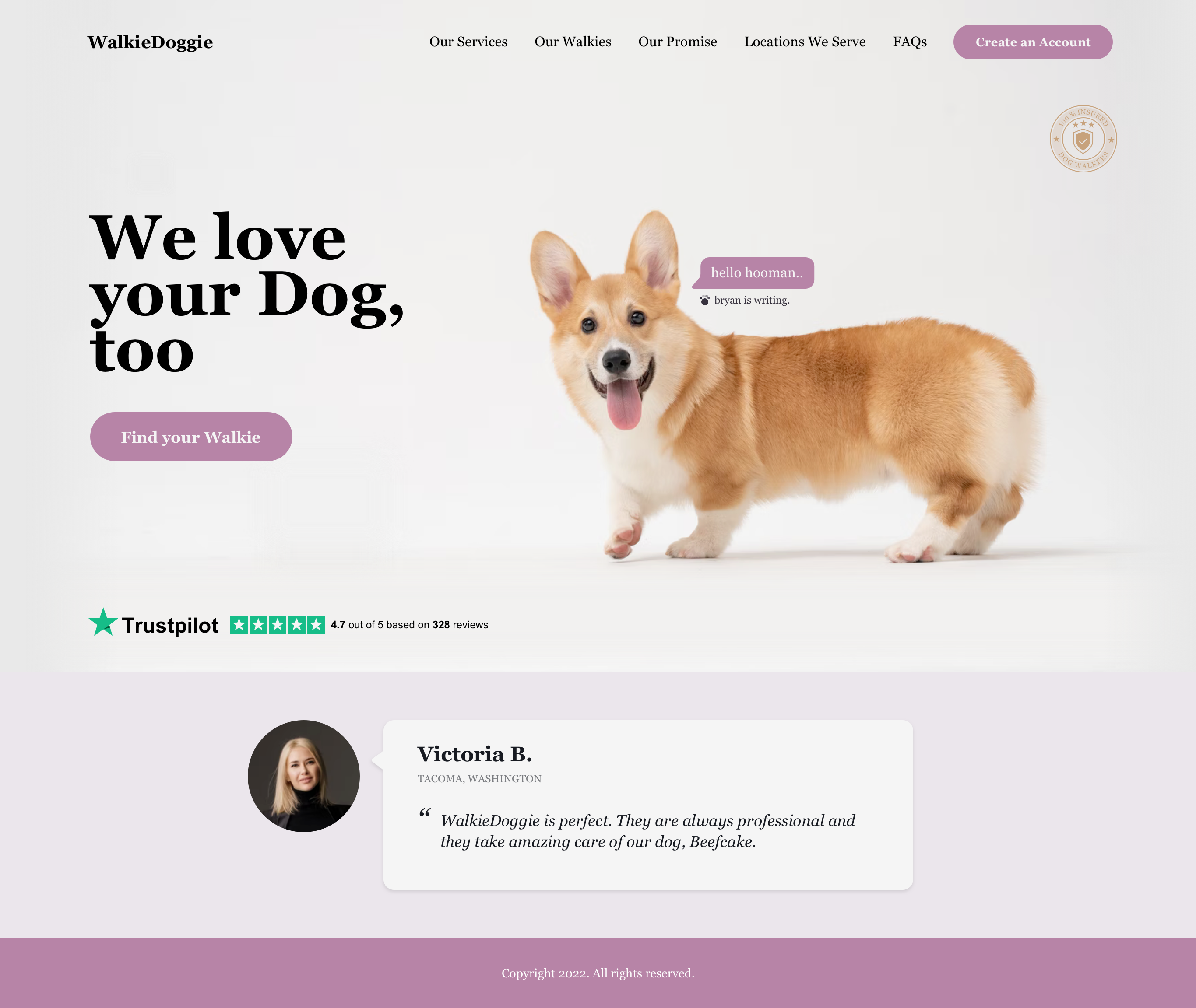
1. Keep Your Landing Page Clean and Clear
As soon as a visitor lands on your page, you have on average about 8 seconds to get their attention, so you want to show only the essential information: show what benefits the user will get and how you can solve their problems. By hiding any unnecessary clutter, you will avoid the users from being distracted and keep them on your page. Present your brand, show what you can do for them and the exciting offer you have. Leave no room for confusion and move the visitor down the conversion funnel.
2. Show Relevant Content
When a person is coming to your page, they are usually searching for a solution to their problem or need. It is worth doing some investigations on how users are getting to your page – what are they searching for? How are they getting to you and why? Then offer them a positive user experience so you can turn them into customers. Once you solve the customer’s need, you will build the trust bridge, and they will recommend you to family and friends.
3. Limit the Number of Call to Actions
A CTA, Call to Action, is a key element of the landing page, as it compels the visitor to perform the action. It’s usually a button and one of the most important elements on this page. While you might be presenting more things/offers on your page, you should use only one CTA button so the visitor is not taken to another page by clicking another link.
A well designed CTA button, will stand out, by using a high contrast to the other elements on page and it should have a strategic placement – above the fold. The naming of the button is best when it directly says what the user is getting by pressing it like “Download Guide”, “Create my Free Account”, etc.
4. Keep Your Form Short
Many times, the CTA buttons are accompanied by a form to capture a few user details. The form should always be kept short, because the longer it is, the more the chances the user will drop off. Ask only for the essentials. Less is more in this case.
5. Make Your Headline Captivating
The first thing a user reads when he lands on your page is the headline: bold, attractive and pointing how you solve the user’s problem. The statistics show that on average, 8 out of 10 people will read the headline, but only 2 of 10 will read the rest. A good headline will be useful to your visitor, will be specific, provide them with a sense of urgency, and show that the benefit from your product is unique.
6. Use High-Quality and Relevant Visuals
People by nature respond much faster to visual content rather than text and this is because 90% of the information transmitted to the brain is visual and they are processed 60,000 times faster in the brain than text. Studies have shown that site visitors spend 100% more time on pages that contains compelling videos, rather than text only. Read more here. This is why whenever you want to show your product’s benefits, it would be best to add some nice icons or instead of having just a contact icon, you could replace it with your photo. High quality images of your products will also help with the selling and give a great look for your page.
7. Add Trustworthy Items
A trust signal or item will indicate to the user that your brand and offer are trustworthy. This can take different forms like: testimonials from previous customers to reassure visitors, or it can be done with “Like” counters from different social media sites. Another option, is to use trust badges which can be either logos of the well-known brands you have worked with, in the past or recognitions you’ve received, or groups that you’re part of.
Producing an effective landing page is critical for converting visitors into users. All Topcoder projects and businesses are different, but the best practices are the same. Focus on creating a clean design with relevant content to deliver a great landing page.

DaraK
Guest Blogger