October 14, 2019 Types of Dashboards (Based on Information Hierarchy)
So you have data and a blank dashboard. Combining both can create visually appealing and informative devices for both technical and non-technical people. But just combining both is not enough. You have to plan strategically and logically how you will incorporate the data into your dashboard. In this article, I will introduce some types of dashboards according to information hierarchy.
KPI Dashboard
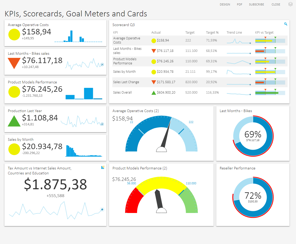
As the name implies, this type of dashboard contains Key Performance Indicators that upper management usually monitors on a regular basis. It is good for providing a quick snapshot of what, where and when information that others will then take action on or investigate. Not all KPIs are included in a single dashboard. Only the most relevant for the current goal or objective are included, and this changes only as the need arises. As a word of caution, note that this type of dashboard is not meant to answer why and how questions.
Q&A Dashboard

This type of dashboard is not your common dashboard that contains charts and declarative titles. Its difference is in the chart title, which is in the form of an interrogative sentence, with the chart as a visual answer to the title question. It usually shows the most urgent questions within an organization or segment of the organization. It’s like an expanded version of a KPI Dashboard and has richer context and comparisons. This is good for executives looking to track multiple issues on a regular basis.
Top Down Dashboard

In this type of dashboard, every chart that belongs on a single dashboard is under a single topic (either Sales, Shipping, Expenses, etc.). It shows high level, aggregate KPIs as well as specific details that could provide more context or insight. This is good for middle management who are responsible for overseeing or managing a discrete component of an organization. They usually want to know a high-level overview before looking at the detailed form for further investigation.
Bottom Up Dashboard

This type of dashboard provides more focus on granular details of objectives and compresses the information into easy-to-digest KPIs. With this, the performance of specific data points is more important than the aggregate performance of all of the data points. This dashboard type serves the need of identifying specific issues that require action or intervention. It is good for people who have a more detail-oriented approach.
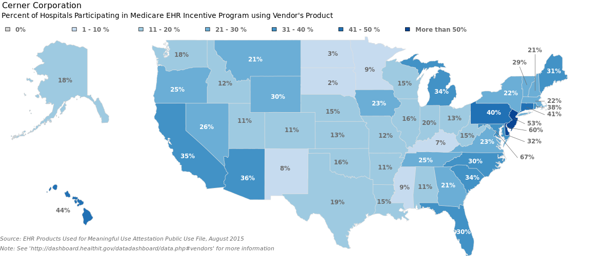
One Big Chart Dashboard

This is a type of dashboard that combines simplicity and complexity. Simplicity because it only contains one chart that is usually in the form of map or scatter plot that requires a lot of space to render all the details clearly. Complexity because it condenses a myriad of information into an easily understandable visualization for quick identification of certain behaviors, trends, and outliers. This type of dashboard can also combine a few charts in one visualization, like pie charts on a map and pie charts on a scatter plot. The trade-off for this dashboard is that it is sometimes difficult to interpret the details in a broader context.
Check out this article to learn more about dashboard creation by specific role.
trivia79
Guest Blogger