July 31, 2019 Digital Accessibility
If disabled people were truly heard, an explosion of knowledge of the human body and psyche would take place.
– Susan Wendell
This article will introduce the Digital Accessibility series. The reader will learn how to design and implement digital accessibility in the case of Topcoder.

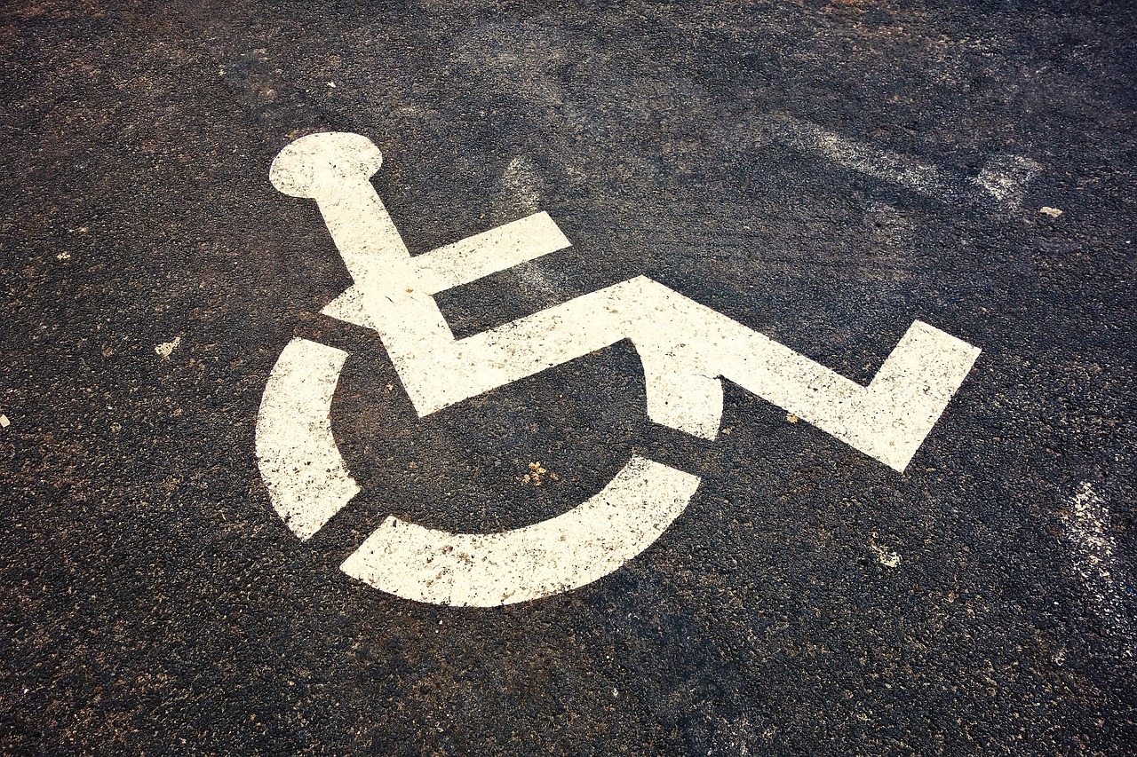
Disabled users need to have the capability to navigate and view web applications, documents, and mobile applications. This capability is referred to as digital accessibility. The disability can be related to the eye, ear, body, or brain of the user. Many tools exist for disabled users to read the content on different channels. Those with impaired motor issues use different equipment for reading digital content. If a person cannot use the classic keyboard and mouse they will use a screen reader and sip and puff switch for input.
Websites with bad design can be tough for disabled users to access content, making it ineffective for them. Good design practices suggest the web user interface elements are designed well. Universal design best practices are used for designing websites to meet the needs of multiple types of users. ALT text tags for images and graphics help the web users who are hearing impaired. Similarly, video content that utilizes captions helps the impaired users.

Search engines index the websites which are accessible. Websites that are well-designed for accessibility help to make the websites searchable. Users with disabilities can search quickly to browse the necessary web content. The content designed for the web might have a different user’s experience on the screen reader for a disabled user. Screen readers identify standard HTML elements such as header, menu, body, and footer.

Keyboard navigation needs to be enabled because some users might not be able to use the mouse to browse the content. Users with muscle control problems and those without the use of their hands can use the keyboard for navigation. User actions need to be designed keeping in mind the visual flow, navigation direction from left to right, top to bottom browsing and navigation of the menu. The other actions which need to be considered for design are clicking on the focused link, browsing the footer, and closing the UI windows and tabs for separation of views. UI elements such as buttons, links, form fields, and data pickers are good candidates for designing for accessibility. ALT attribute for img is shown below.
<img src=”/uploads/bridge.jpg” alt=“Thames River bridge”>
The order of the web browsing or form input needs to be thought out carefully for the disabled user. Focusable elements and indicators in a website need to be identified in the design. CSS elements are used to design the visual elements on a web page. The attributes for the description of URLs need to be meaningful and descriptive. For content like images and videos, ALT attributes can have descriptive and meaningful phrases. ARIA labels help the screen reader in reading the call to action text on the button. They are used to override the HTML labels when designing a website for accessibility. A sample for a href tag is shown below with ARIA label.
<a href=”…” aria-label=”Sign Up for the website”>Sign up</A>

The HTML labels need to be visible and form prompts should not have placeholder text. The forms need to be designed in a single column format. The borders for the text area, text fields and drop down menus need to be looked at for designing the web forms for accessibility. HTML data tables need to have a CSS for layout. HTML tables are typically used for tabular data.
Page layouts need to have CSS for designing the pages for disabled users. Each section in the page needs to have descriptive headings. Semantic markup needs to be present for headings, paragraphs, lists and quotes. The page design needs to factor in left aligned text for easy scanning of the content. The text headlines need to be centered. The lines need to be short for quotes and callouts. Text alignment needs to be chosen as a theme for the page design.
The page fonts need to be selected for page design. Basic fonts need to be used. For disabled users with a visual disability, Sans-serif fonts are used in the web design. Picking the right font size is important. Font sizes greater than 12 are recommended. Choosing relative units for font size helps in making the content easily readable. Animations such as blinking or moving text are not recommended.

Color scheme and contrast need to be considered for web design. According to the WCAG (Web Content Accessibility Guidelines), there should be a 4.5:1 contrast ratio for normal text. The other guidelines are 21:1 ratio for black text on a white background and 4.5:1 for gray text on a white background. Page elements such as shapes or icons need to be combined with a color. Web site design needs planning for ensuring accessibility for disabled users.
bhagvanarch
Guest Blogger