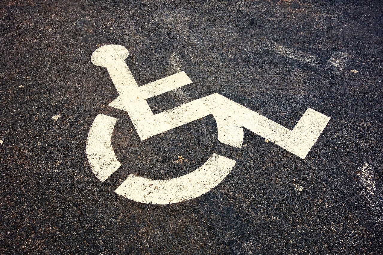
August 14, 2019 Designing For Accessibility
Accessibility is not a feature, it is a social trend.
― Antonio Santos
This article will talk about designing for accessibility series. As part of the series, digital accessibility was covered in the previous article. The reader will learn how to design for accessibility in general.


“Accessibility is solved at the design stage.” This is a phrase that Daniel Na and his team heard over and over again while attending a conference. The requirements of the users need to be included in the design for accessibility. This includes your target users, users outside of your target demographic, users with disabilities, and even users from different cultures and countries. Understanding those requirements is important in creating accessible experiences for them.
User requirements are gathered through user interviews. Different requirements which address the user experience are animation and effects, audio and video, color, controls, font, images and icons, keyboard, layout, material, readability, structure and time. Design constraints imposed by accessibility requirements and a better user experience help in creating UX rich products. Web pages are designed so that they can be tabbable with a keyboard for disabled users that may have a problem with mouse usage. The content and layouts need to be structured using HTML5. Shortcuts need to be provided for easy navigation.
Animations, images, and effects make a website interactive and help in branding it. They can be confusing and create distractions for the some of the users. Flashing effects can trigger photosensitive epilepsy which can result in headaches, nausea and dizziness. Parallax and motion effects can make users feel vertigo-like symptoms. This can be because of vestibular sensitivity. Animations need to be used for scenarios in which short distances are simulated and objects are moving at lesser speeds relative to the screen size. Users need the capability to switch off and on some of these effects at the page level and global level settings.
Typical considerations which need to be covered for animations, images, and effects are related to seizure, dizziness, vertigo motion, distractions due to moving, blinking and autoupdating. Videos and audio help in creating a better user experience. Autoplaying is an option but it diverts the user’s attention and needs to be avoided during the design phase. Videos playing in the background should be avoided. Users should have settings to play, pause and stop the video.
Content like animations, images, videos and audio need to have transcripts, captions, and subtitles to help the users accordingly. Blind users might prefer a transcript for videos and animations. Audio and videos need to be designed looking at various factors related to autoplaying, controls, description and hiding the content. Avoid information in the download icons.

Designing the website for different groups of users helps gain a better user experience. Color is a very important factor in design of webpages. It helps in branding and user perception about the website. For blind users, color really does not help. Users with color blindness may not be able to make out the difference between red, green, yellow and orange. Two types of disease found typically in men are Deuteranopia, which can cause blindness for green colors and Protanopia, which can cause blindness for red colors. Users with Deuteranopia will perceive red as brown or yellow, and green as beige. Protanopia sufferers perceive red as dark or black, and orange and green colors as yellow. Tritanopia disease occurs in men and women. This disease can cause blindness for blue or yellow colors. The blue colors are perceived as green or teal and yellow colors look like violet or grey. Color combinations such as red & green, light green & yellow and blue & purple need to be avoided.

Internationalization and localization of content, images, icons and web pages factor in color specific to that country and cultures. There is difference in Eastern and Asian cultures regarding the representation of colors to positive and negative trends. Patterns, icons and text descriptions are used to handle colors and the cultural differences. Icons which are filled are better than outlined ones.
Color is used for highlighting the content and showing errors. For making the pages and form visually accessible, tooltips, thick borders, bold text, underlining and italics can be used to show errors. Contrast ratio of text to its background is another factor which needs to be a minimum 4.5 to 1, according to WCAG. Based on the font size 19 or 24 pixels bold, the minimum changes to 3 : 1. Users with low vision, color blindness and worsening vision can read the text based on the contrasting factor. The other settings like Windows High contrast mode affect the design of the pages with colors. The design factors to be considered for handling colors are the usage of color, oversaturated colors, contrast factor, foreground and background colors.
Interactive content such as UI controls help users interact with buttons, links, inputs and other elements related to web and content. The size of the controls is an important factor for visibility and invocation of the controls. Those users with tremors and lacking dexterity might have trouble in pointing the controls. The control’s location and size is a design factor related to click target. Users with standard or adaptive pointing devices need to have comfort in pointing and clicking the control. W3C’s Authoring Practices for Design Patterns recommends accessible design patterns including menus, modals, autocompletes, trees, tab sets, and etc..

Hovering needs to be avoided in designing for accessibility. Secondary actions in the menus or non-modal dialogs need to be used instead of hover states. They can conceal the trigger. Secondary icons’ color and contrast need to be lightened. On hover they need to be darkened. Larger hovers need triggers for tangible controls. Instead of white space, an info icon is better to invoke a content filled hover.
The position of the controls plays an important role for touch screen users. Nesting of controls causes errors for touch screen and web users. WCAG suggests the minimum size for the UI control is 44 x 44 pixels. Google recommends 48 x 48 pixels. The minimum size has padding for the control. The design factors for choosing controls are related to size, positioning, padding, nesting, text visibility and type of the screen (touch or web). Form fields need to be labelled inside the label element. Placeholder text should not be used for naming the label.
Material is a very important design factor for web page design. The look and feel of an element or a web control is related to material honesty. Styling of links as button or placing them next to each other is an issue. Autocomplete menus are another component which can cause problems for keyboard or screen reader users. Material honesty design factors are related to user honesty, element behaviors, combination of distinct behaviors and the look and feel of the elements.

Text readability can cause tiredness and mental taxation. Important factors are related to sentence length, paragraph length and language complexity. Content needs to be designed with headings, lists, menus, footers and images. Headings help in grouping and summarizing the information. The design factors for readability are idea behind the text, simplicity of the language, length of paragraphs and usage of the UI controls. Suggested line and paragraph spacing is atlas 1.5x for better experience. Voice over tools help blind users for communicating the intent and description. The description of the content and controls is placed as alt text. Live text need to be used instead of flattened. Avoid text in images during design. Text hierarchy needs to be maintained. Text blocks of 80 characters need to be used to help users with narrow fields of vision. Bulleted lists are also recommended. Avoid underlined, italics and capital lettered text. Ensure spell check is done for the text in the web pages. Idioms and figures of speech need to be avoided.

The amount of time spent by the user on a page is a design factor. Session management plays an important role in time out of the sessions and their expiry. Users need to have control to prolong the session on a page. Design of the pages should ensure the users can ask for the preferred channel for communication or support. They need to be given reasonable time for an action to be finished.
bhagvanarch
Guest Blogger